Every global brand ensures that it maintains consistent branding across different markets, demographics, languages, and locations. They try to create an ideal balance between keeping their branding communication consistent and personalising it for their target consumers or audiences.
Multilingual desktop publishing falls right into this sweet spot. This process helps brands in creating a seamless brand image with elements like colours, fonts, text, layout design, etc. Think about it – why are we so quick to associate a shade of red or yellow with the fast-food giant McDonald’s? This strong association has formed over time as we kept noticing these colours in their stores, menus, pamphlets, websites, merchandise, etc. That there is the beauty of multilingual DTP.
In case you would like to gather some more information about the topic, here’s all you need to know about multilingual DTP. Now, let’s look at some examples of brands that have utilised multilingual DTP to localise their communication for each market successfully.
Starbucks
Starbucks is known to be a premium food and beverage brand in India. Naturally, when Ahmedabad and Vadodara’s citizens learned that Starbucks is coming to their town, they were quite excited. Starbucks didn’t hold back either – they did the perfect job of telling people that they have ‘something for everyone.’
Note: Ahmedabad and Vadodara are metropolitan cities in the state of Gujarat, India.
Gujarat’s culture is defined by the importance it gives to ‘family’ and the various relationships that come with family. Families give Gujaratis a sense of belonging, and this is why you can still find many of them who embrace the ‘joint family’ system. Everybody lives together within a close-knit community and supports each other through thick and thin.
The best thing about Starbucks and Gujarat is belonging. Get together with your family and friends at our new Vadodara store at Ground floor, Center Square Mall, near Genda Circle, Sarabhai Road and enjoy the special Starbucks experience. #HereToBelong #MeetMeAtStarbucks pic.twitter.com/JYtWVONH1p
— Starbucks India (@StarbucksIndia) December 23, 2019
Before they launched, Starbucks got its potential customers excited with social media posts, pamphlets, and billboards. Their messaging shows that they did their homework. It reflects the core values people of Gujarat swear by while also assuring them that Starbucks, too, is all about ‘belonging.’
Their campaign hashtag #HereToBelong was the cherry on top!
Snickers
Owned by an American company Mars, Incorporated, Snickers has been running successful campaigns for their Indian audiences. They smartly localised their marketing tagline – ‘you are not you when you’re hungry’ – for the Indian consumers. Hunger acche acho ko badal deta hai (Hindi) translates to ‘hunger gets to the best of us.’
They also localised their brand tagline – ‘Hungry Kya? Grab a Snickers’ for various Indian languages. Check out one of their billboards in Bengaluru, Karnataka.
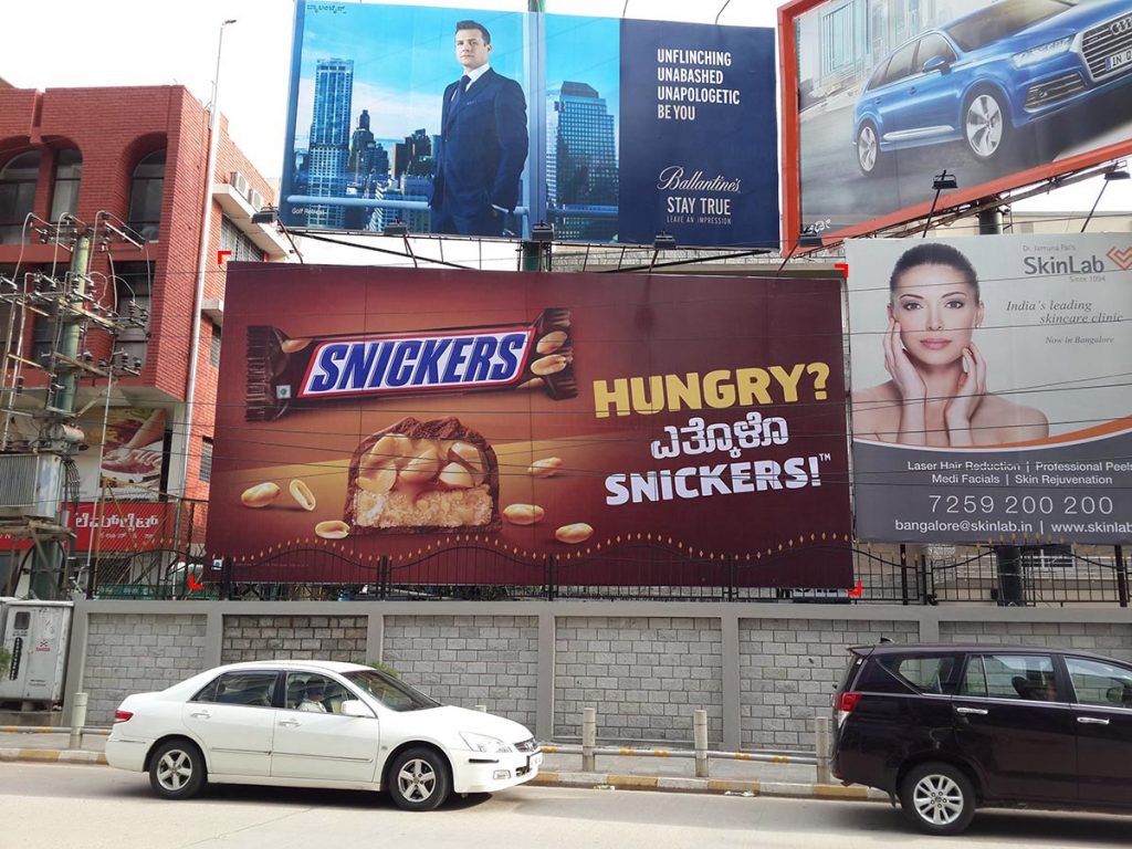
They also utilised bus shelters by putting up these posters.
Here’s another successful Snickers campaign where it introduces its new almond chocolate bar.
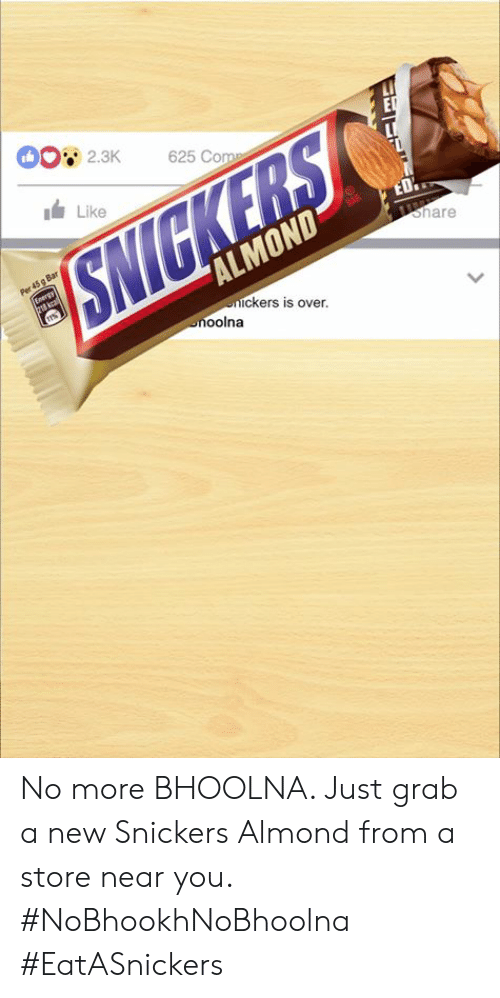
In India, almonds are associated with intelligence, memory, and high cognitive function. Indian parents insist on their children having almonds at the beginning of their day. Snickers took this association and merged it with its consistent hunger-centred campaign. #NoBhookhNoBhoolna simply translates to #NoHungerNoForgetting. As you see, Snickers smartly played on the Indians’ almond-eating habit to attract their attention.
Here’s a good day and a god way for reminding your friends to give your money back - Just make them #EatASnickers Almonds, kyunki #NoBhookhNoBhoolna pic.twitter.com/RrEqOjzhUc
— SNICKERS India (@Snickers_IN) August 4, 2019
Kuwait Airways
Given the diverse set of customers and clients they cater to, travel brands must pay special attention to multilingual communication. Lack of access to information due to language or cultural barriers can hamper their customers’ experience and discourage them from choosing the brands’ product/service next time.
When my colleague was flying with Kuwait Airways, she was pleasantly surprised to find that their in-flight magazine had content both in English and Arabic. Adjusting these languages in the design layout is no mean feat – Arabic is written from right to left while English is written from left to right. But, multilingual DTP made it possible for Kuwait Airways to make their English-speaking customers happy while also giving them a glimpse into the Arabic culture.
They’ve extended this bilingual approach to all forms of communication. All their notices, billboards, magazines, brochures, etc., are available in both English and Arabic.
تنويه للعملاء الكرام بخصوص بعض الاستفسارات والطلبات #الكويت_تستاهل #الكويت_تتصدى_لكورونا #الكويتية pic.twitter.com/W9f2UdXQE5
— Kuwait Airways (@KuwaitAirways) June 16, 2020
Did you notice how they’ve kept the design elements (colours, fonts, watermarks) consistent in both languages?
Apple
Everyone knows about Apple and its products. Apple is a global consumer electronics brand that appeals to and connects with everyone. But, Apple went a step further with its ‘shot on an iPhone’ campaign. It created a perfect blend of user-generated content and localised marketing.
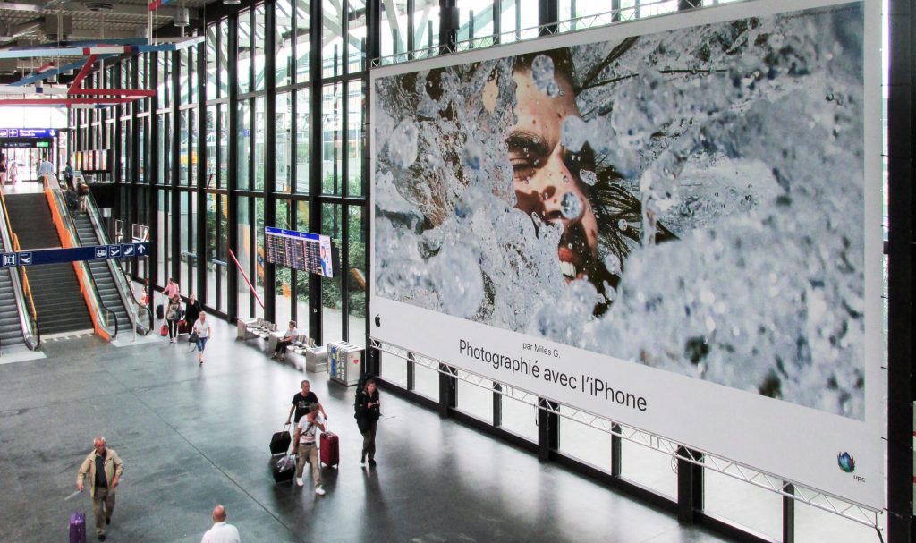
Apple has been a pioneer in mobile camera technology and mobile photography. Apple users swear by their iPhone’s excellent picture quality. The brand’s ‘shot on an iPhone’ campaign encouraged customers to share pictures they clicked with their iPhones.
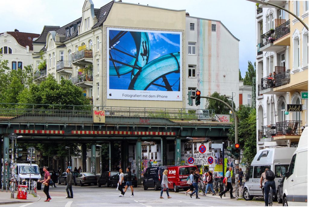
These photos were a part of a theme – Sunshine Everywhere – which reflected what summer means to people around the world. The photos show beaches, sunglasses, happy faces, water slides, etc. These photos were taken by people from different parts of the world, from different walks of life – bookkeeper, homemaker, engineer, and more.
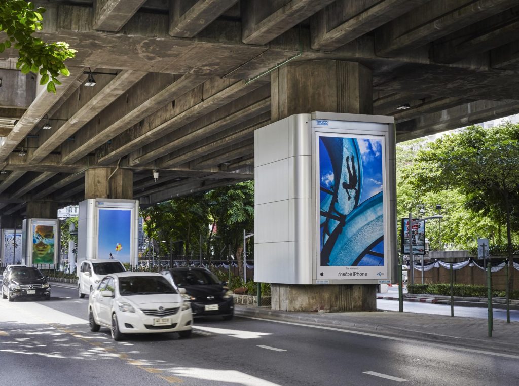
Apple displayed these photos on billboards across the world with the name of the iPhone user who took the picture. They displayed it in various languages, making the pictures locally relevant.
Conclusion
Multilingual DTP isn’t just restricted to billboards or posters. It can be utilised for a variety of digital and printed content – company presentations, restaurant menus, product packages, and labels, etc. It has been helping global brands create ‘inclusive’ content and branding where they make a point to appeal to people culturally – market them the products as per their beliefs, preferences, and language.
An ideal multilingual DTP service is a combination of excellent design skills and translation skills. Availing this service can help in maintaining a consistent brand image with professionally done design layouts and culturally appropriate translation.


